Graphical thoughts on the ZG1K customization…
 |
| I’m still working through the proportions of a naked Concours. It isn’t a delicate device… |
 |
| In spite of the colourful nature of the bike, it’s a muscular heavyweight. |
 |
| A box shaped rear fairing working off and 80’s race bike vibe combined with a minimalist cafe racer look |
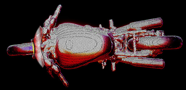
 The paint’s already coming off the tank. I need to figure out how to make a rough 3d outline of the rear body work (cardboard, wood, thin metal?) in order to begin getting an accurate sense of how the back end will look. If I can get handier with 3d editing software I’ll 3d print a few various prototypes first (maybe scan it with cardboard panels in place).
The front fairing will be a minimal street-fighter type of thing. I wanted to go with a bikini fairing, but it’s a bit too delicate for the big shoulders of the Concours. Monkeying around in Photoshop has gotten me this far:
But this is more of a sculpting thing than a pen and paper thing. I need to make some cardboard outlines and see what feels right in 3d (Close Encounters style).
The Mike Tyson/heavyweight feel of the Concours means I’m thinking more melee fighter than I am lightweight and delicate.


